Humanodoro is a phone-free focus tool paired with a smart pad. When you place your phone on the pad, the app automatically starts a timer and keeps you accountable by checking that the phone stays in place. I was invited to redesign key parts of the app after the team struggled with an outdated interface, unclear structure, and a Figma file that was nearly impossible to scale. My goal was to bring clarity, consistency, and a modern interaction flow so the app could grow without breaking.
read more: humanodoro.com
Personal notes on the project
I enjoyed working on this redesign because it felt good to bring clarity to something that already had a strong idea behind it. The original design wasn’t scalable, but it did have character, and making everything uniform risked losing that personality. To keep the product feeling human, we reintroduced colour accents, custom duotone icons, and small visual themes. This project actually started when I reached out to the team and offered a free redesign in exchange for publicity, which later turned into a paid engagement. Most of the work focused on improving the UI, but we also made UX adjustments, such as simplifying how users add or remove buddies. We also added a daily streak mechanic to give users a simple, motivating reason to return to the app.
Problem
• Outdated visual design that didn’t reflect the product’s purpose
• Inconsistent layout and no clear hierarchy
• Figma file was messy, with no auto layout or scalable structure
• Screens were difficult to update or extend, slowing down development
• Core actions weren’t obvious enough for first-time users
• Design system didn’t exist, making alignment impossible
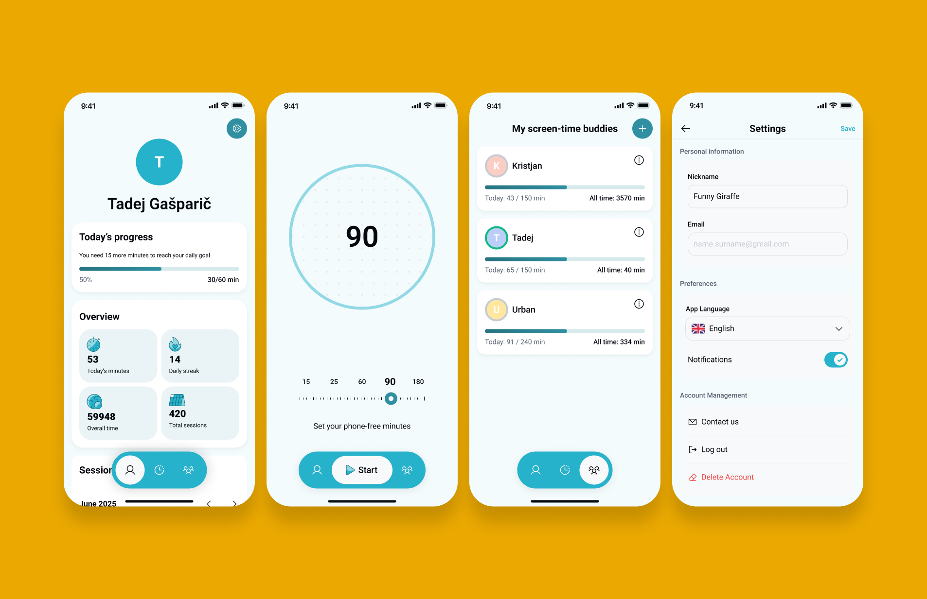
I started by mapping the original screens and identifying the structural issues. Then I reorganised the layout using auto layout and component patterns to build a foundation the team could maintain. After sketching the new flow, I redesigned the screens with a clearer hierarchy, simpler actions, and a modern visual style. Throughout the redesign I focused on scalability, so future features wouldn’t require rebuilding the entire UI.
I simplified the layout by grouping information into clear sections, reducing cognitive load and improving the scanning experience.
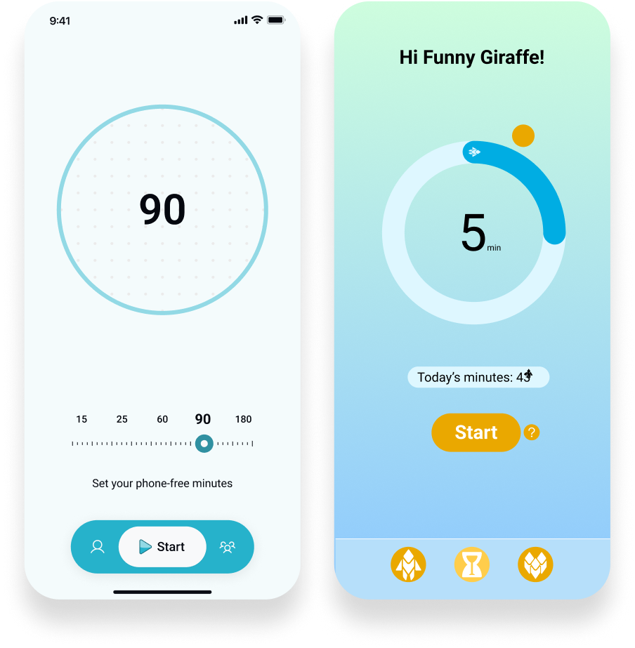
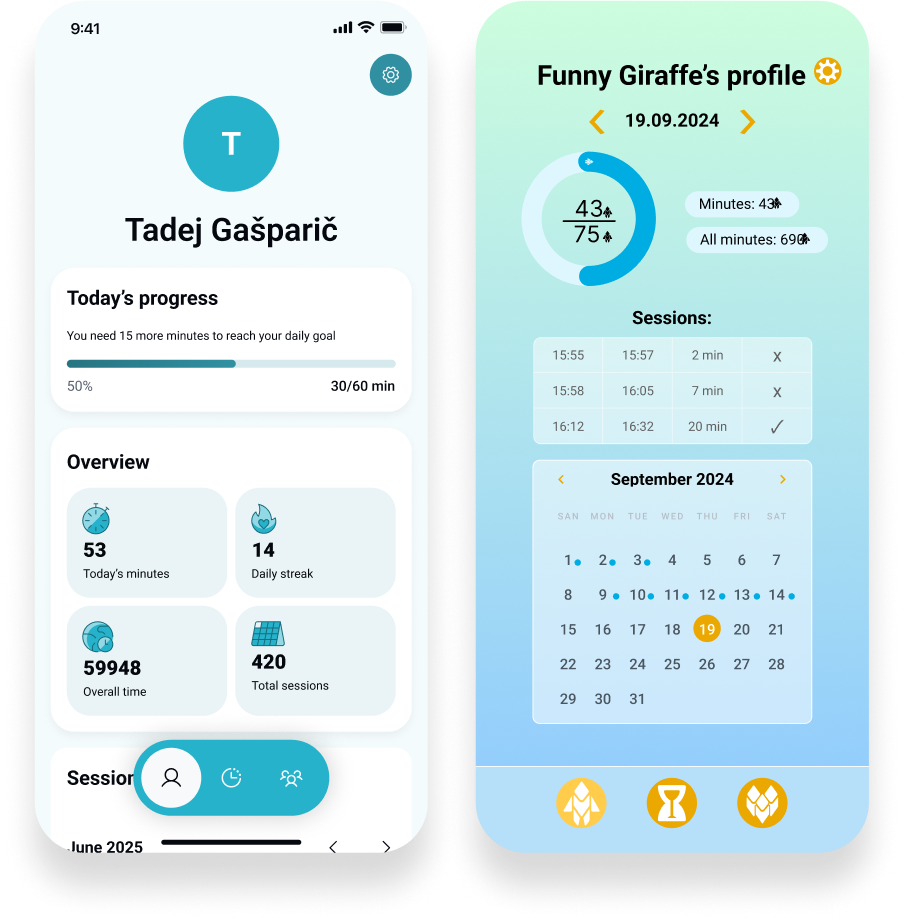
Before:
• The screen tries to do too much at once: calendar, session list, statistics, progress, date navigation, icons
• No grouping. Everything competes for attention.
• The gradient background adds visual noise.
• No hierarchy: all elements look equally important.
• The UI feels overwhelming and unfocused for a product about distraction-free time.
After:
• Clean top section with a clear user identity.
• Simple progress module with a single primary metric.
• Overview cards grouped into a unified component style.
• Calm background, neutral colours, minimal cognitive load.
• Clear separation between “Today’s progress”, “Overview”, and “Sessions”.
• Much stronger hierarchy and scannability.
I redesigned the buddy list screen by removing visual noise, organising the content, and creating a clear, scalable card layout.
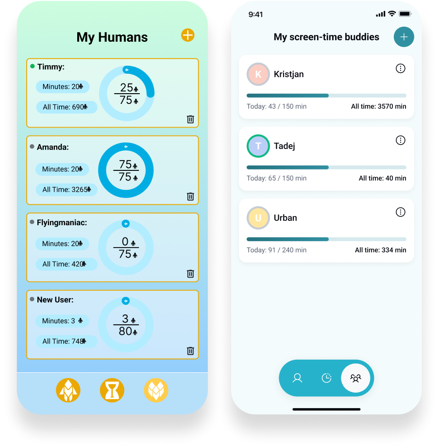
Problem
• Overwhelming gradient background and decorative icons that distract from the content
• Inconsistent card layouts with uneven spacing and competing visual elements
• Circular charts add unnecessary complexity and make comparison difficult
• No clear hierarchy, making it hard to quickly understand each user’s progress
After
• Clean, neutral background that puts focus on the information
• Consistent, scalable card system with clear alignment and spacing
• Simple progress bars that make comparison easy at a glance
• Clear navigation and a structured layout that supports future features
Final thoughts
This project reminded me how much clarity and structure can improve both the user experience and the team’s workflow. I enjoyed combining clean UI with small touches of personality so the app still feels human. What started as a simple redesign offer turned into a meaningful collaboration, and it confirmed that reaching out, experimenting, and taking initiative often leads to the best work.